HSFramework-Public
Handshake CSS Framework Project 2021
A live demo of this framework can be reviewed here
Purpose
This project is a ground up rebuild of the Handshake UI Framework that includes SASS modules from:
- Selected components of Bootstrap 4.5
- Kendo Bootstrap Theme SASS files
- New CSS created to support general Handshake usages, especially in Connect 2.0
This Framework may be used for any Handshake Installation and Connect is not required. The Build files are available to Handshake customers on request.
References
Besides this document, your best references for this framework are:
Table of Contents
Usage
To use this repository to create a new/custom client build
Clone this repository
All you need is the GitHub project folders and files. You are not required to download, install or use Git unless you intend to check files back into this repository.
If you do plan on updating this repository, make sure that you understand how to fork the project and create a pull request for the updates.
Setup your build environment
This version of the build process has dropped node.js, npm, gulp and node.sass; The build process has been simplified to just what is required to support the compilation of the sass files into both framework and standalone css files.
All necessary files are included in the repository. This includes node_modules, and dart_sass. These should not be updated without testing.
To simply build the framework use the dart-sass\sass.bat command file. You provide the source file and the target file, and you are done.
Some Examples include:
REM Compile the framework to the HS Themes folder.
dart-sass\sass scss\hsframework.scss "C:\Program Files\Handshake\HandshakeThemes\Themes\HSFramework\hsframework.min.css" --style compressed --quiet

REM Compile a custom verison of megamenu to the themes folder
dart-sass\sass scss\megamenu.scss "C:\Program Files\Handshake\HandshakeThemes\Themes\HSFramework\css\megamenu.min.css" --style compressed --quiet
Watch.ps1
Also included is a powershell script to watch for changes in the source and compile those changes to the target. The script will monitor for changes to the framework files, or standalone scss file.
Framework files are
- scss/hsframework.scss (or the file identified in the $framework parameter)
- any files that start with an underscore character, like (scss/_tiles.scss).
If a change is detected in a framework file, the hsframework.scss file will be compiled to the target directory. This includes deletions/rename of “_” files. Note that deleting or renaming the main framework file is not supported, and results can be unpredictable.
If a change is detected on any non-framework file, then that file will be compiled to the target/css directory.
If a non-framework file is deleted, then the target/css files will be removed, if it is rename, then the old files in target/css will be removed and the file will be re-compiled with the new name.
All activity will be logged to the ../dart-sass/sass-watch.log file.
watch.ps1 parameters
- source : the folder to watch, by default this will be ../scss
- target : the folder to write .css files to. default is ../release; this can be set to the HSFramework Themes folder; The framework will be built in the targer folder; non-framework files will go into target/css
- dartsass : the location of the dart compiler, defaults to ../dart-sass
- framework : the name of the master framework file, defaults to hsframework.scss
- hsupdate : For security reasons this process cannot write files directly to the Handshake Themes folder, use -hsupdate to copy the release folder to the themes folder after the compile. the value “default” will copy the release files to “C:\program files\handshake\handshakeThemes\Themes\HSFramework”
Usage
<# use all defaults #>
.\watch.ps1
<# after compliation, publish changes to the custom handshake themes folder on the d: drive #>
.\watch.ps1 -hsupdate "D:\Program Files\Handshake\HandshakeThemes\Themes\MyLawFirmTheme"
<# after compliation, publish changes to the handshake themes folder on the c: drive #>
.\watch.ps1 -hsupdate default
The watch process will run as long as the powershell terminal window is open.
Note: this is not tested in the PowerShell IDE. You should open a powershell command window.
Modules
The framework is broken down into the following modules.
User Profile Cards
User Profile Cards provide a number of options for displaying user information. It is both responsive and declarative. Meaning, at a “phone” level breakpoint, it will automatically display a compressed view, or your may choose to display the compressed mobile view even on a large screen.
Them html markup should contain 3-4 areas:
- Photo section - designated by the class ‘hs-upc-photo’, optional if hs-upc-nophoto class is used
- Header - designated by the class ‘hs-upc-header’
- Details - designated by the class ‘hs-upc-details’
- Footer - designated by the class ‘hs-upc-footer’
Sample markup
<div class="hs-upc">
    <div class="hs-upc-photo">
        <img alt="" src="https://thispersondoesnotexist.com/image" />
    </div>
    <div class="hs-upc-header hs-upc-shade">
        <div class="hs-upc-title">Cameron Simmons, Partner</div>
        <div class="hs-upc-subtitle">Intellectual Property, Chicago</div>
    </div>
    <div class="hs-upc-details">
        <div class="hs-upc-h-group">
            <div>1919 North Main Street, Suite 6000</div>
            <div>Chicago IL 60606</div>
            <div>cameron.simmons@jlalaw.com</div>
        </div>
        <div class="hs-upc-v-group k-mb-2">
            <span class="p-office">512.555.1212(o)</span>
            <span class="p-mobile">512.555.1212(m)</span>
            <span class="p-fax">512.555.1212(f)</span>
        </div>
    </div>
    <div class="hs-upc-footer hs-upc-shade-primary">
        <div class="hs-upc-v-group">
            <span class="k-button k-flat">E-Mail</span>
            <span class="k-button k-flat">Bio Page</span>
            <span class="k-button k-flat">LinkedIn</span>
        </div>
    </div>
</div>
Using CSS in your skin, you can also dramatically alter the layout of the components. For example, this css would create a layout with the header on top, and the photo between the deatils and footer section.
.hs-upc.hs-upc.my-custom-upc {
    grid-template-areas : "header header header photo" "details details details footer";
    grid-template-columns: 1fr 1fr 1fr 25%
}
Helper Classes for hs-upc
In addition to the section classes, the following css can alter the view for specific use-cases. The following class names are pre-fixed by hs-upc-
-
**shade or shade-[primary secondary dark light]**: sets the background color of a section. - h-group, v-group: display the content in the section as either a vertical or horizontal list
- stacked: sets all sections in a single vertical grid
- compact: set the photo and header on top, and puts details and footer stacked beneath, this is also the layout that will be used on small viewport
- title, subtitle - child elements of the header section, will expand font size and spacing on medium and greater view ports.
Note: except for hs-upc-photo, the content contained in a particular section is arbitrary. If your use-case doesn’t require a section, like a footer, then supply a grid-template-areas rule that leaves that section out. The photo section expect a photo, if you do not have/need one, then add hs-upc-nophoto class to the root element.
User Profile Sample Cards
Standard

Mobile

Stacked

Kendo Tab Styles
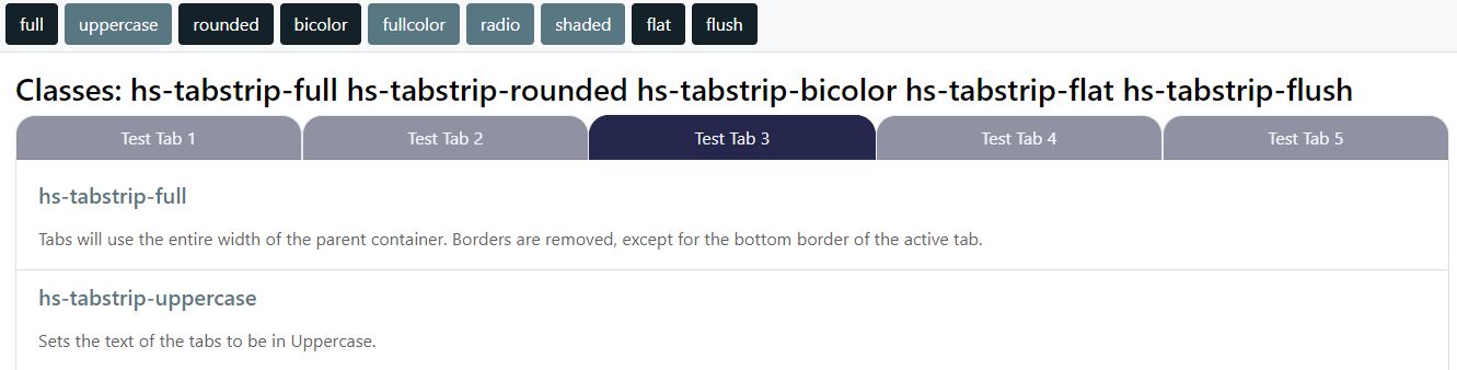
The following classes are included to support useful customizations to kendo tabs that use appropriate bootstrap and kendo variables. They are each pre-fixed by hs-tabstrip-
- uppercase: Sets the text of the tabs to be in Uppercase.
- full: Tabs will use the entire width of the parent container. Borders are removed, except for the bottom border of the active tab.
- bicolor: Sets the Active Tab to a background of $tabcolor(a), and all inactive tabs to $tabcolor(b). Text color is set using a function to determine optimim color based on the background-color. A slight box-shadow is set on the active tab.
- fullcolor: Sets the background color of each tab to $tabcolor(a..e), then repeats. The opacity of inactive tabs is $tabcolor(opacity), while the opacity for active and on hover tabs is 1 A slight box-shadow is set on the active tab.
- rounded: Set a radius to the top left/right corners. Radius is defined in the $tabcolor(radius)
- radio: Renders the tabs as a set of radio control buttons
- shaded: Tabs will use full width of the parent container. Active tab will use $tabcolor(a) as the background. Hover backgroud will be $tabcolor(b).
- flat: Removes any box-shadow that may be set by another class such as hs-tabstrip-fullcolor.
- flush: Removes padding and border of child elements such as a HTML5Grid or a list-group inside an HTML5ListView when it is a direct descendent to the active tab container
- hs-tabstrip-cleanleft: Provides a cleaner/minimal vertical-left tab interface.
TIPS Many of these classes may be combined like fullwidth & fullcolor, but not all will make sense like fullcolor and bicolor. For consistency in your site, you may elect to use and Application Option variable to define on or more class name that may be used in the skin.
<html5tabstrip class="{tabstrip}" ...>
where tabstrip = “hs-tabstrip-fullwidth hs-tabstrip-uppercase” in the Application Options Table
Tabstrip Sample
Kendo Listview
With Kendo build v2020.2.513, which is included with Handshake 3.9.5 kendo fixed an inconsistency in the listview structure by adding a “middle” element between the listview parent node, and the individual list items.
This means that a class name that is used to control direct decedents, like flex and grid, are added to HTML5ListView class list, it will not be applied to the list items as expected.
Work around
This has been resolved by the dev team by moving any classnames or styles applied to the HTML5ListView Element a level down to the k-listview-content element. There is one use case where this does not produce the desired result, and that is when you do need to apply a classname/style to the HTML5ListView Element. In this case you would need to apply a classname to the HTML5ListView container, and construct your css to act on the child element (the HTML5ListView) of that container.
ListView Border
Standard OOTB kendo ListView behavior adds a border to the kendo listview element. It almost every use case in Connect this ends up a producing an undersireable double-border effect.
Rather than turning it off 95% of the time, the default behavior has been changed in this framework to remove the border. If you need an HTLM5ListView element to have a border, apply hs-listview-border class to the parent container of the HTM5ListView element.
Minimal Pager Style
This Framework along with templates included in Connect 2.0 provide a minimal bulleted listview pager control.
HCP20-PagerSelectTemplate
<li class="hs-listview-bullet-pager"><a tabindex="-1" href="\#" class="k-link hs-inactivelink"><span class="k-state-selected"><i class="k-icon k-i-circle"></i></span></a></li>
<li class="hs-listview-bullet-pager">
    <a tabindex="-1" href="\#" class="k-link" data-page="#:text#">
        <i class="k-icon k-i-shape-circle"></i>
    </a>
</li>
Classes to produce a minimal page style
Apply these to get a minimal / bulleted list view pager. These classes must be applied to the parent div of the HTML5ListView element.
- hs-center-listview-pager
- hs-hide-outer-nav
- hs-pager-minimal
Samples
Handshake Layouts
This framework provides a number of pre-defined layout options. They are built using CSS Display Grids. The Bootstrap Responsive Grid Framework is not included in this build, and every effort has been made with these layout to mitigate that.
All layouts are responsive, in that on mobile devices that will appear as stacked elements.
CSS Grids are the most straight forward way to construct page layouts, if you have a complex custom use case it is not difficult to build that in the skin with appropriate CSS. css-tricks is an excellent resource if you are just starting with CSS grid.
Supplied Layout Classes are:
- hs-grid-magazine : provides full width header, left and right sidebars, main article and full width footer
- hs-grid : basic grid declaration
-
hs-grid-[ double triple quad ] - hs-grid-84split : responsive 2 columun layout with left being 3/4 the width, and the right being 1/4
- hs-grid-48split : responsive 2 columun layout with left being 1/4 the width, and the right being 3/4
- hs-grid-resp2col : response 2 column layout with a header, sidebar (2/5), main (3/5) and footer. Note that the sidebar may have a fixed/max width in the skin and it should layout correctly
Helper classes
- hs-rtl : moves the main content to the right of the sidebar, default is to the left
- hs-grid-demoware : applies fixed height, width padding and content to the hs grid elements for validation/testing without content.
HS Action Items and Tiles
Tiles
Tiles display child elements in a boxed container. Elements will be spaced and centered evenly in the container.
You may use hs-tile as a standalone container or grouped in a grid using hs-tile-grid.
Container Classes include:
- hs-tile-grid
- hs-tile-grid-sm
- hs-tile-grid-lg
- hs-tile-grid-landscape
small, large and landscape will effect all tiles in the container
The container class will have one or move divs with a class of hs-tile.
- hs-tile : 150px
- hs-tile-sm : 150px * 0.75
- hs-tile-lg : 150px * 1.50
- hs-tile-landscape : creates a tile with a 16:9 width/height ratio where width = 185px
- hs-action-tile-landscape: elements classed as hs-action-metric, hs-action-icon and hs-action-title they will be positioned in a grid using
grid-template-areas: "metric icon""detail detail"; - hs-teams-tile : a special class that will set the colors to match Microsoft Teams for both dark and default mode. Outside of teams it will render as a normal tile, as long as it also has hs-tile class.
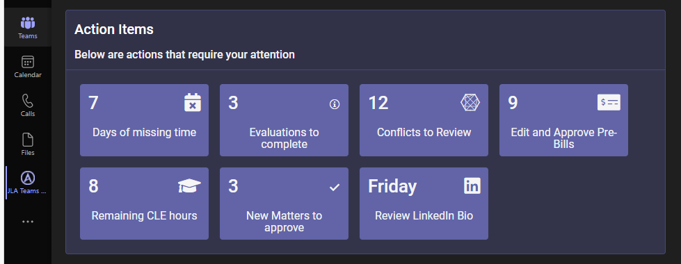
By default the contents of the tile will be rendered as a flex column, centered on the x/y axis and spaced using just-content:space-around.
Tile class names may be used outside of a container class for an individual tile.
All Bootstrap Color Theme names are available to control the color of the tile
- Primary
- Secondary
- Info (default)
- Success
- Warning
- Danger
- Dark
- Light
To set the color use the class hs-tile-grid-{themecolor} or hs-tile-{themecolor}
Basic Markup for Container Tiles
<div class="hs-tile-grid">
    <div class="hs-tile" onclick="someaction();">
        <div>Some Title</div>
        <div><span class="k-icon k-i-image k-icon-xl"></span></div>
    </div>
    <div class="hs-tile" onclick="someaction();">
        <div>Some Other Title</div>
        <div><span class="k-icon k-i-image k-icon-xl"></span></div>
    </div>
</div>
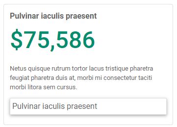
Action Tiles
Action Tiles are a way to present the state of some business activity and a way to act on that state. This could be conflicts that need to be checked, bills to approve, time entry that is late as examples.
A action item may contain one of more of the following elements:
- Title
- Metric
- Description
- To Do link
Sample: an action tile
Action Metric Colors
All Bootstrap Color Theme names are available to control the color of the action metric and icon.
- Primary
- Secondary
- Info (default)
- Success
- Warning
- Danger
- Dark
- Light
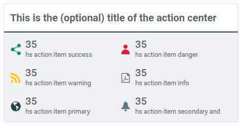
Action Groupings
Actions may be grouped as:
- A vertical list using the class hs-action-tiles-list
- A horizontal list using the class hs-action-tiles-group
- A box of smaller action icons in the class hs-action-tiles-center
- A smaller action item using hs-action-button will display just a title and a metric.
You can add the class hs-action-sugar to the top level grouping for
Sample: an action center
HTML Markup
Below are some sample markups, which can be see in the live demo site.
<div class="hs-action-tile hs-action-danger">
    <div class="hs-action-header">Missing Time</div>
    <div class="hs-action-metric">3 days</div>
    <div class="hs-action-detail">Please enter your time ASAP</div>
    <div class="hs-action-todo">Open iTimekeep</div>
</div>
<div class="hs-action-item hs-action-success">
    <div class="hs-action-icon"><span class="k-icon k-i-share"></span> </span> </div> <div
            class="hs-action-title">Interdum agestas ut lectus</div>
    <div class="hs-action-metric">1.2K</div>
</div>
SeeMore
SeeMore is a set of functions and classes that allow you to quickly and easily create an interactive UI/UX inside an HTML5ListView that will expand/collapse more details about an item.
The classes include hs-more, hs-more-toggle and hs-more-toggle-open.
| Classname | Note |
|---|---|
| hs-more-toggle | used in seeMore, defines the visual element that allows the user to toggle the details |
| hs-more-toggle-open | state to display the toggle element with the details ahve been opened |
| hs-more | class named for the details. Will be hidden initially, and toggled open and closed |
For SeeMore to function the HTML Markup generated by your template should look something like this:
<div class="list-group-item">
    <div>
        <span class="hs-more-toggle" data-uid="123-123"></span> This is a title
    </div>
    <div class="hs-more" data-uid="123-123">
        Some hidden details until the user clicks the toggle above
    </div>
</div>
See the function __HS.Connect.seeMore in HCP20Common.js for additional technical details.
Helpers
Font Icon Helpers
A few helper classes are included to extend the usefulness of the kendo web fonts.
- hs-icons-stack : this class will overlay 2 child elements that are both kendo icons.
- hs-stack-2x : the larger of the 2 font icons
- hs-stack-1x : the smaller of the 2 font icons
- hs-icons-stack-2 : when added to hs-icons-stack the 2 child element will be 1.75em as large.
-
hs-stack-[top bottom]-[left right] - will position a smaller icon in the specified quadrant of the larger icon - hs-icon-[theme-color] - support all named themed colors: info, warning, success, danger, etc…
Sample markup
<span class="hs-icons-stack">
  <i class="k-icon k-i-edit hs-stack-1x"></i>
  <i class="k-icon k-i-cancel-outline hs-stack-2x hs-icon-danger"></i>
</span>

<span class="hs-icons-stack">
  <i class="k-icon k-i-file hs-stack-2x"></i>
  <i title="checked out" class="k-icon k-i-check-circle hs-stack-bottom-right hs-icon-success"></i>
</span>
Bootstrap
This framework is built from the @Progress/kendo-bootstrap-theme npm package. It includes many, but not all, bootstrap utilities and modules. Modules were excluded if:
- It had a similar feature built into kendo (card, navbar, modal)
- Required bootstrap javascript in order to function (carousel, collapse)
- Caused excessive complexity in an environment that would include SharePoint, Kendo and Bootstrap (responsive grid system, reboot)
- Feature did not justify the overhead (progress, transitions)
Included modules are
- Default Variables
- spacing
- text
- display
- borders
- shadow
- sizing
- tables
- jumbotron
- list-group
- images
- flex
- colors
- type
- root
- media
- breadcrumbs
Excluded modules are
- Responsive Grid System
- transitions
- tooltips
- toasts
- spinners
- reboot
- progress
- popover
- pagination
- navbar/nav/tabs
- modal
- dropdowns
- collapse
- buttons
- carousel
- forms/input
- badge
- accordion
Weekly Build Notes
Below are notes by week of changes made to the framework
Aug 16 - 20
- Refinements for Ms Teams Dark Theme
- Added Sean’s fancy Ribbbon the cards.scss
Aug 1 - 6
- Added _myhsclient.scss to allow for project customizations. added this file to .gitignore to not track changes.
- Removed unneccessary code k-card-header in _card.scss
- Modified default chart palette
- Modified Teams Tiles / Brand color a little darker.
July 26 - July 30
- Set font-family for div[__hsrootnode] to $font-family-base
- Remove references to imported fonts Roboto and Open Sans in favor of Segoe UI
June 28-July 2
Few changes this week.
- Modified default font family to match what is used OOTB for SharePoint Online and Team Sites
$font-family-base: "Segoe UI",system-ui,"Apple Color Emoji","Segoe UI Emoji",sans-serif; - Modified gulp to update the ExtraNetSite.css file in the ../Themes/Extranet/Custom folder as well.
- Added sharepoint.scss to deal with SP / Bootstrap / Kendo conflicts.
- fixed issue where SharePoint makes button a min width of 6em; button.k-button will have a min-width of 0;
June 21-25
- .hs-grid-respcol : modified class so that
- The “sidebar” element can be given a fixed or max width in the screen, and it will still layout properly
- On “md” to “xl” monitors the template will be “main main main sidebar sidebar” and on x+l monitors the layout is “main main main main sidebar”
- Added code to better handle list-group > list-group-item in teams dark mode
- Exported Teams colors to :root variables and added to colors.html page
- Supress extra border around list-group-item when it is in a k-card container, but not in a k-card-body container.
- Fixed an issue with hs-listview-border to correctly reapply a border around k-listview-bordered when desired. The default border around
k-listview k-listview-borderedhas been suppressed. Adding hs-listview-border to the parent element of the HTML5ListView will restore the default. - Numerous adjustments to fine-tune color settings when running a skin in teams.
- Added hs-card-img-left which is a simple card structure with a 150px image on the left and a body on the right. The image will be in a circle. To override use:
<img class="hs-card-img-left-image square" />
sample markup for this
<div class="hs-card-img-left">
    <div>
        <img class="hs-card-img-left-image" src="#:photourl#" />
    </div>
    <div class="hs-card-img-left-body">
        <div class="hs-card-img-left-title">#:fullname#</div>
        <div class="hs-card-img-left-subtitle">#:jobtitle#</div>
        <div class="hs-card-img-left-text">
            <div>#:phonenumber#</div>
            <div>#:department# (#:office#)</div>
            <div>
                <a title="mailto #:email#" href="mailto:#:email#">
                    <i class="fas fa-envelope"></i>
                </a> e-mail
            </div>
        </div>
    </div>
</div>
June 14-18
Tiles
- Refined the code for hs-tiles.
- Added class hs-tile-landscape to render a tile wider than tall (16:9)
- Added class hs-teams-tile to render tiles in MS Teams colors for default and dark mode. If a tile has the class hs-teams-tile and is rendered outside of teams, it will be ignored. So,
class="hs-teams-tile hs-tile-primary"will render one way in teams and another on a SharePoint Page
MS Teams
Add styles to adapt to how Teams should look in default and dark mode, currently:
- Tabs rendered in teams will default to the Teams tab styling
- Colors set in k-cards, bootstrap and kendo themes class (i.e. text-primary or bg-secondary) will be overridden when rendered in teams, depending on the teams theme in play
- Scheduler colors will be overridden for the Teams palette
- All teams colors are exposed as :root variables (see colors.html)
Expect ongoing improvements to ms teams apps over the next several weeks
Colors
Based on consultant input, added a number of color variables to work more closely with custom/designer demands:
- Additional accents Accent1 .. Accent2, exposed as :root variables and also as text and backgrounds:
- hs-text-accent1, hs-text-accent2, etc.
- hs-bg-accent1, hs-bg-accent2, etc..
- A Gray theme added gray-black, gray-dark, gray-disabled, gray-border, gray-light, gray-white
- hs-text-gray-dark, hs-text-gray-disabled, etc..
- hs-bg-gray-dark, hs-bg-gray-disabled, etc..
- Rebuilt ../src/colors.html to show these changes more clearly.
Tabs
- As noted above, styles added for tabs rendered in Teams
- Added hs-tabstrip-compact – renders tabs using only an underline with minimal spacing, borders. Active/Hover underline will display only beneath the text and the width of any tab element is limited to 20em;

Build
Added the following files to the build
- _root.scss – code to expose more custom variables as :root vars
- _connect-ui.scss – custom connect styles, moved several from hsframework.scss to here
- _text.scss – code to expose custom text colors, i.e. hs-text-accent1